First Things First – Manifesto

Final work with a A2 poster and a web banner.

“Create the future by learning from past mistakes”

Screen Shot-poster
This is the final A2 size poster

 &

Screen Shot 2016-04-01 at 12.03.09 pm

This is the same style of web banner

This two are my final piece of this project, but before that actually I have tried a lot of thing and change many times the finally I did this. You can see in the background there are a lot of images of the hand holding an image and those are my process work it represent that’s my mistake before I done my work. All the mistakes became my successful final work, and I have said before in the requirement we can only use two colour so I chose this colour between maroon and red-wine and really dark red, and white doesn’t count because it is paper colour. This colour looks like represent mistakes and white can make a really strong contrast, and I made a white frame because I want people to focus on inside the frame when they first look at it. There is something I quite like first is the expressive typography like the “FUTURE, PAST and MISTAKES”, second is the images and the white frame both of them are around the quotes so people will concentrate in the middle.

Now I am going to talk about before I done what mistakes I have made.

Screen Shot 2016-04-01 at 12.07.26 pm
This is another poster I did

Actually it looks quite special but what I think it too many white space so looks really empty, but at the same time I like the text made by the background, it is so simple but looks good.

Screen Shot 2016-04-01 at 12.09.11 pm
And this is the same but just with black line
Screen Shot 2016-04-01 at 12.08.33 pm
And this is the background of the text
Screen Shot 2016-03-24 at 2.09.55 pm
hand-drawing quote

This I drew by hand, because I want to try more thing before I got any idea, I took ages to do that but at the I still didn’t use it and the reason is because it looks so messy I will so you and you will understand what I mean, when you just look at this black and white is really good but when it mixed with other things and colours it seem too much.You cannot see the background very clear also some of the text like disappear, so at the end I gave up, I put this on the other piece as well but still not as good as I think therefore, I decided not to use it.


Screen Shot 2016-04-01 at 12.07.48 pm

This is the other piece I had tried, I cannot tell where is the problem but I can feel that isn’t right. Also I don’t really like it, maybe because of it looks too much but I am still not so sure. It is a very good experience, at least I have tried and let me know how it work how didn’t, I will keep this idea in my head because I think I can get inspiration on it one day. It will look good when it use in a right place so I have to keep explore until I found out the best way for using it.  

Screen Shot 2016-04-01 at 12.06.20 pm
At the end I did this and brought it to the presentation 
Screen Shot 2016-04-01 at 12.05.04 pm
This is my classmate thought

In the presentation the tutor gave me some suggestion to improve my work like some of the upper case and lower case of the text, the size of  the quote and the colours etc. Then my final piece came out, and the web banner before I didn’t know what to do so I try something out because my brain feel blank.


If you ask why I have to do that I can just tell you I don’t know, at that moment I just do different experimental hope I can got some inspirations on it. I did some research and tried it made those hole by using needle. Thus, I talk to the tutors and some of the classmates and they said that I can make a thing with similar style as that poster so I decided to make a web banner at the end. In the web banner I change the position of the text and images also I put them in different layer also I have adjusted the colour make it not look like the same, because if they look exactly the same then it is no point to make another one I can just copy that’s it.

On the below there are some of the relevant research for my ideas of this project:


First Things First – Manifesto(research)


Quotes, manifesto and poster research

This is the manifesto poster I found online, and the most interesting thing is the colour you can see the main colour in those posters are red and orange(the colours looks quite a long ago ). It shows the century and what is happening on that time, so I can say it is very clear to tell people what’s the story about it. And about the first things first it was published in 1964 and 2000 respectively and it was our starting point to made our own manifesto future generation poster. It is very interesting to see how people collaborate thing together in different century, in fact there are not specific way to make a poster but we will still learn from the past and put our ideas together and make a new thing. However, is it not difficult to make a poster but how can we let people feel comfortable and attract people.

And those I found it in the online it about different style of poster and manifesto, try to find something are unusual, make in different way because as what I said above there are no right or wrong answer of making a poster so we can make it whatever we want, but just don’t forget we are communicating to the others so make it clear and attractive is our purpose.

Also I did some research in the library so I borrow some books, Graphic Design TimeLines, Idea Generation, Graphic Design Thinking and Design Research etc. I was looking for some special poster and graphic design and some expressive typography ideas. Due to there are too much good ideas so I just picked some of them randomly. Lastly, all of the research are very useful because when you are looking at people works at the same time we are learning so I did learn a lot of thing on it.

First Things First-Manifesto (ideas & process)

After the research I got some ideas and I though my own quotes because our tutor told us do what we believe and some of the quotes which I had search in the internet, I don’t agree with therefore the best way to do is create my own quotes. Next step is think about what kind of image I should use for the poster, in the require everyone have to use an image but it did not say anything like we must use the image we took by ourselves so it makes me quite struggle in it. Therefore, I took a lot of images which around my quotes and some of the main words.

My  first idea is around some words like: future, design and change, my first quote is ‘Don’t let future change your design But use your design to change the future’ and the idea is saying we shouldn’t just design something for that century because it means we are like changing our because of the future, but we should use our design to make a new future. This is my first idea but I want to make sure I got an extra spare if the tutor does not agree with it, I still got another to show them. For this I think of the other quote and it is about: future, succeed, try, mistakes, the quote is ‘Before succeed, you must go through many mistakes’. And this what I want to say is before become a successful designer, we must try at least a thousand time make mistakes as much as we can, learn from the mistakes and to improve more.

These are the first quote ideas and some draft future, design and change)

These are the second quote ideas, drafts and some hand-made practice works (success, future and mistakes)

And there are some digital piece of the first quote

On the tutorial we have to show them what we got and what we have prepared so I show them all the thing above but my tutor suggested me to combine those two quotes, actually both of them are not bad but if  I link those two together it will match more the brief now it seem a each got a bit but not prefect yet. I agree with what he said therefore, I have to  think a new quote for combining those two together. Finally I decided my last quote ‘Create the future by learning from past mistakes’ and I start to do some draft and decide the images.

This is my draft in my sketchbook, different style of expressive typography and typeface

Those pictures are about what is “MISTAKES” mean and how it looks like.

Just a lot of practice but haven’t decided the style and colour yet try more new thing hope can get more inspiration in it.

workshop(Ps & Id)

Practice and know more about how to us Photoshop and Indesign together, also focus on the duo tone only use two colours to make a poster and final we have to know how to print out A2 size with A4 paper.

Choose one image with high quality and play with colours, mixed two colour in duo tone. And I chose two images about animals for no reason just found it online and placed it in different position and also I cut out the background and made it in different effect, colour, shadow, and outline the purpose was explore more technique.

Screen Shot 2016-03-23 at 10.39.50 pm
This is the poster I did, and there is no specific topic so I chose “HELP & SAVE” to be the theme. Help the animal and save our world.

After I place them together it looks like a natural advertisement poster, also like a warning  poster so finally I put the text on top it said “HELP & SAVE”. What I want to say is save our world and our animals, the earth is dying if we keep doing what we are doing now not only the animals, the forest but also the human and the place that we are living are the same all the thing will perish and become extinct. I did some drawing like some petro is flowing down, it represent the earth is killed by it.

Screen Shot 2016-03-23 at 11.16.15 pm
This is the black and white version, which like my print.

However, there is something that I have to improve like as you see the colour, when I was  doing the poster I didn’t feel anything wrong, and I really like the colour but after I done later I look back the colour I feel a bit wrong even though the colour is nice the purple was still too light and the opacity was a bit low so it makes not clear enough. Because of if when I printed it out in black and white  I can’t actually see those pictures, that’s the thing that I have to pay more attention for my Manifesto poster. Both black and white and colours were too light especially the deer at the bottom, you can only see the shape or you have to zoom in bigger and bigger and in the middle those little pig were fine but the colours still too light, I think is better to turn the red or blue more and make it darker. Lastly, the tiger was covered by the petro and the colour suddenly change to blue it seem a bit strange. But I really like the text it was simple and big enough also have a big contrast colour, when people look at it the first thing must be the text then is the petro then will be those images. Communication – the main way is to speak then is writing so most of the time I will try to show the text bigger, put them in top or the first place make sure people will read them first.


Expressive typography

An exercise of practising about expressive typography 

First exercise is to listen someone is speaking a sentence and we have to think about how can we write it out. The thing we have to focus on is the length and where is the strongest point, after we have decided the best way and we have to use brush and ink to write that sentence on a A2 paper.

You cannot express the right feeling if you didn’t paid enough attention, just like what I said above we have to listen the emotion of that guy, which word he emphasised and how the speed of his speaking etc. After we can think about the colour, we got black, green and red but I use black because I think green doesn’t match and red looks too strong like a warning colour then finally I chose black. Each people did few pieces in different way, let us practice more.

Those two are the work that I did, compare to both you can see the different first is the typeface are totally one is the normal hand writing style with bold line and the second piece is a elegant style script especially the “S” of so but actually both of the got a same point is the size of the sentence are quite similar. For example, HE, So, Famous, He and Dressed those are the word that we have to focus on and the others of me I just have to show it because they are not very important so they were a bit small compare to the main words. And I wrote it in two style because I want to know and see the different how would it be feel, just make it different to practise more.

Screen Shot 2016-03-20 at 4.06.34 pm
Our work 

You can see how different people did, and it is a very good experience to practice and see how people work and what they are thinking. All people listen the same sentence but have different feeling so make the thing be different. I really enjoy it and it help a bit for my coming project.

First Things First – poster(practice)

Screen Shot 2016-03-01 at 8.28.40 pm
This is the second poster I did

After the first dropping pot poster, I want to try more different thing so I did this poster. I used the pot to be the poster background, I traced the image and changed the colour effect also increased the stroke size gives a thick border around. Inside the drop shadow there is a layer style and I turned the noise quality into middle made it looks stronger and there are three colours of the pot light pink, indian red and cherry to make the pot looks hot and dangerous.
Next, is the part of the hand, i use the quick selection tool to isolate the background then rotated it and put it in different position also every hand I have tried different gradient colours see how it matched with the pot. Lastly, is to put a text into the poster and I think ‘hot’ is quite a good word for that pot then I tried in different typeface, I want to find some which looks serious. Then I changed the colour between orange and yellow because it will not be the same colour as the pot but it can shows the feeling ‘hot’, also I want to show people that looks like someone is shouting the word ‘HOT’ therefore, I made it in 3 dimensional with really bold. At the end, I put the the word in the middle stand out very powerful, and make the opacity in to 50% make sure it doesn’t cover the pot and those hands.

First Things First – Poster(Practice)

Using photoshop to make a poster with some images with hand and objects.

We look up some examples of poster are between 40s~50s, and most of them are colourful (especially like yellow, red and blue is the most popular colour that people used) and with very strong line, also we saw how people collaborate different elements.

Screen Shot 2016-03-01 at 8.29.17 pm
This is my first practise piece

There are few things we have to try, like inverting the image, parts of the image or parts of the object also create new layer with different types of sections. The main thing is try as much as we can, make a collage of two or three photos.

First, I did is to isolate the hand and the object from background and change it in different colour. In this poster, there are two layers with the same design. The bottom layer I made it very colourful, I had try different colour and different gradient editor match with a really strong yellow. And the reason of choosing yellow because the colour of my hand is between deep pink and magenta also with lime and yellow on the palm print and those are very strong colour so I chose yellow for the outline made a contrast with the pink.

After I did the hand, I create a new layer of making the object and  I choose a teapot to be the object. First I did is the same to delete the background and copy and paste more pot  put them in a different position, make it look like someone be very careless so the top was falling over. And those pots I made it all in different colour, start with red and yellow it looks like a very hot pot so the person can’t hold it, the second pot change a bit from yellow, red to green and the connect to the third pot green and blue. The fourth pot have a lot of colour pink, medium-blue, purple and teal, and the last pot is sea-green, gold and orange. But actually except the first pot have some meaning of the colour, and the others just for playing with different colours mix and visual effect no any reason or why doing it. 

Screen Shot 2016-03-01 at 8.29.35 pm
This is the same thing as the top layer 

The top layer, actually I just copy the whole bottom layer paste on top made it like mirror image and in totally different colour, the contrast with colourful for me is black and white, but I don’t want cover my bottom so I did it in black and transparent also change the opacity to 50% make sure people can see both layers.


MANIFESTO


Screen Shot 2016-02-17 at 2.36.47 pm
This is one of the bunting 

After the last project ‘The house of the future’, we have to start our manifesto but all of us were very confuse we didn’t know actually know what we have to do. We had ask the other group, some of them made a book, some made a cake and some went to town and gave flowers and hug to people so it seem very random and finally we decided to continue work on the house.We have six people in our group so we divided infix part of the house (rooftop, bathroom, kitchen, bedroom, games room and transport )and each one choose one part and use a word or a short paragraph to make a piece of bunting. And our idea is at the end when everyone done their bunting and we just have to put them together then it will be our manifesto but that’s just our idea. (It doesn’t work at the end)

We keep contact and send message to each but after the first presentation there are some people didn’t turn up and didn’t reply the message. Until the day of the presentation, which is about showing people the concept of our manifesto, but I was a bit frustrated and angry because there are only two people turn up included me. All of us work individually on that bunting, it is so difficult to present due to there are threes parts were missing. But compare to another group we are not the worst, in our big group we have 45 people, however only 10 people in that presentation and one group was missing, most of the group just got few people. Eventually, we still did it finish the presentation and our tutors gave us some feedback and want us to improve more because this is a concept but not the final work, so they don’t expect we done the project, conversely they are looking forward to see us can do better.

Screen Shot 2016-02-24 at 9.12.18 pm
After talk to the tutors we change our ideas and we made this poster

This time we focus on the technology and the sustainability of the house and we did a lot of research, look up some example and ideas of the house then made this poster.

Our tutor suggest us to put into the projector and show in the heart space but because of the words are too small so is quite difficult to see. So after we done the poster we just print it out and posted it on the wall of B block.

This final piece made by three people only because the others didn’t turn up.

The House Of The Future

Futurism

In people ideas all the things in the future will be automatic, touch screen, robots and machine. And in this project we designed a house which we think how it looks like in the future. 

Screen Shot 2016-02-24 at 9.11.36 pm

That’s our ideas that we think how should a house be like and what it have in the future.

(And this poster is made by the graphic students (Me and the other student)

We used those words to make a poster because we think it is a easy and clear way to show our ideas to people, also “DIGITAL HOUSE” is our topic name and represent it will be a digital generation.

Screen Shot 2016-02-17 at 2.37.01 pm
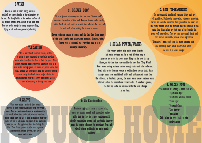
This is our draft, and our concept is a dome because of the Sea-level rise so most of the place will be cover by the sea and it will not have enough land to build house. Therefore, if people have to develop then will have to  through the sea.

In the draft, it shows half of the house is under the water and half of that is above it. And we divided the house in six part, which is roof top, bathroom, kitchen, bedroom, game room and transport.

This field project every student have to work with other different courses students, and the main purpose of that is they want us to learn how to work and communicate with different kind of people also we can inspired by other and learn different skills from others. 

Screen Shot 2016-02-17 at 2.36.56 pm
This is our sketching draft of the house.

In our group, we have two graphics students, one study textile, one illustration, one fine art. And we think because all of us have different skills so what we do is to got the same idea and concept on this draft, then do it individually  whatever they want but the main thing is to show people our house. And finally, we got different thing to show and it became a series of works.

This drew by the textile student

Screen Shot 2016-02-09 at 10.22.52 pm
This drew by the illustration student
Screen Shot 2016-02-09 at 10.24.02 pm
This made by the fine art student

In our presentation, I think we did quite well but of course is not the best. But in the whole project, there are something I feel disappointed is contact people, like we didn’t have enough conversation. So for me i prefer talk to people face by face because even we send message to each, some people saw it but never reply or some didn’t read our message and pretended didn’t get it. And that’s also the problem for many people, people turn up because that is our responsibility also we want to learn thing in here, but it is so difficult work in a group with the people who never been in.

Campaign-Final work

We have used two weeks to discuss and decide our ideas, so the last week we have start working of the works. And for me I am going to make some bus stop poster/ advertisements also put some cartoon characters in those picture.

This is the pictures mixed advertisement that I made and the message we want to show people is telling them GMOs is in everywhere, it becomes a vey common things in foods. Also we try to attract children by using those characters, let they want to know more about GMOs.

Also I did some bus stop advertisements playing with different colour and typeface, because we try to keep everything be very simple so the colour scheme is from the nature and vegetables. It looks like a slogan so it is quite easy to attract people and let them pay more attention. Our aim is want people know what is GMOs, the danger of having too much GM foods, and where can they find out the hidden of GM sources. Therefore, our campaign is to attract people attention in a interesting and simple way, not only adult but also children or I can say actually is for everyone.

Here is our blog link – http://growth-spurt.tumblr.com

All our work are in this website, also this project is quite a challenge for everyone because this is the first time we group together with the people we don’t know very well and have to do a four weeks project. But honestly I am quite lucky to with the people who always turn up and did works also give a lot suggestions and ideas so I am really glad to work with them. Team work is the main thing and a challenge that we have to learn in Field, and after this project I do really know how important and how difficult to work with different people.